Threads of Wisdom: A Uniform Guide
Uniforms can be one of the trickiest pieces of branding to work on. The stylish threads should flow seamlessly (pun intended) with the brand story esthetic of the restaurant while also considering budgets and offering comfort and functionality to your employees. Though it’s almost impossible to meet all the criteria, through trial and error, Second Sight Design has prioritized these four touchstones in their uniform selection process.
Avoid the Ninja Look
When the topic of uniforms comes up, the natural leaning of a restaurant is usually towards all black. The look is cohesive, easy to source in a range of styles, available in various pricing and sizes, disguises stains – what’s not to like? Chromatics would make the argument that black is considered an appetite suppressant according to the food color wheel. As designers, we believe that guest facing employees play as much of a role in your brand as your restaurant’s interior design. Rather than having servers fade into the background of your concept with the usual stealthy, ninja look, choose inviting colors that will instead complement your restaurant’s story and enhance the experience of each charmed table they greet.
Function Over Fashion
Let’s face it, food stains, sweat marks and everyday wear and tear are inevitable circumstances within the fast-paced, high impact environment of a restaurant, but they all can be mitigated. Put your best foot forward by ordering samples then test wash every piece. Even if employees have two or three sets, they will be washing them multiple times a week and you want to ensure it’s a well-made garment that will hold up to the elements. Try not to fall into the trap of picking the less expensive option; you might be paying less up front, but you’ll be replacing uniform sets more often. Avoid mid-range tones, like grey, on shirts to minimize the appearance of sweating and steer clear of black (are you noticing a theme?) for employees working outdoors in warmer climates. Choose an apron with a stain guard available in various styles from Chef Works or add your own to combat the messy food spillage bound to occur.
Flex With Retail
It’s no secret that ordering in bulk yields the best savings, but the 48-72 per unit price break range can be quite overwhelming for a small restaurant. This is where retail enters the chat. By designing a fun t-shirt with mass appeal, you have the potential to sell half to customers at a 100% mark up and pay for the cost of your uniforms with the retail program alone. Furthermore, your guest becomes a walking advertisement for your brand well beyond their dining experience. Second Sight designed three unique t-shirts for The Naughty Fox on Catalina Island to split between their employees and retail program. Using cheeky brand related taglines like “Feeling Foxy” “Fox Yeah” and “Make Pour Decisions” on their server and bartender shirts, they’ve successfully pivoted functional uniform wear into money-making guest fashion. Even if retail isn’t feasible, keeping extra uniforms in storage becomes handy for new hires and quick replacements due to damage.
Bet on Extra Flare
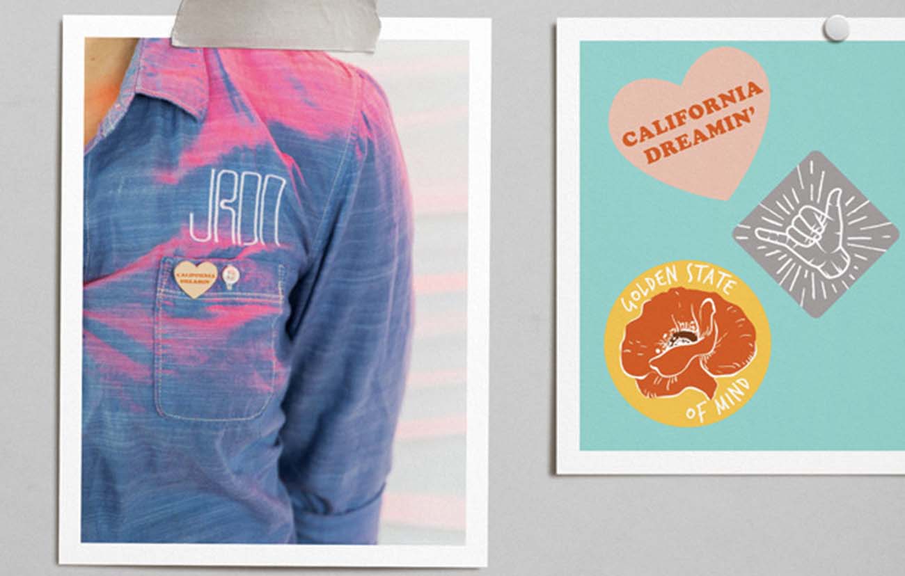
Time to accessorize. This is your chance to be memorable and help further emphasize your story. While including your logo on employee shirts can help with brand reinforcement, avoid logo slapping on every single piece of the uniform set and instead opt for unique flare opportunities to achieve a cohesive, brand forward look. Try thinking outside the box by replacing the standard apron with a trendy fanny pack at a playful, rooftop space or adding enamel pins adorned with catchphrases like “California Dreaming”, like Second Sight client, JRDN Restaurant. Sometimes flare comes in the form of personal expression. At Rambler Coffee, a 70s inspired, roadside café, Second Sight provided denim jackets with custom patches and asked employees to choose their favorite band tee of the era to wear underneath.


